“Barcelona House Oozes Color” plus 3 more
“Barcelona House Oozes Color” plus 3 more |  |
- Barcelona House Oozes Color
- Shelving Units
- Cars Parked Inside Homes: Pretty or Pretty Weird?
- Step House: Fabulous Minimalism
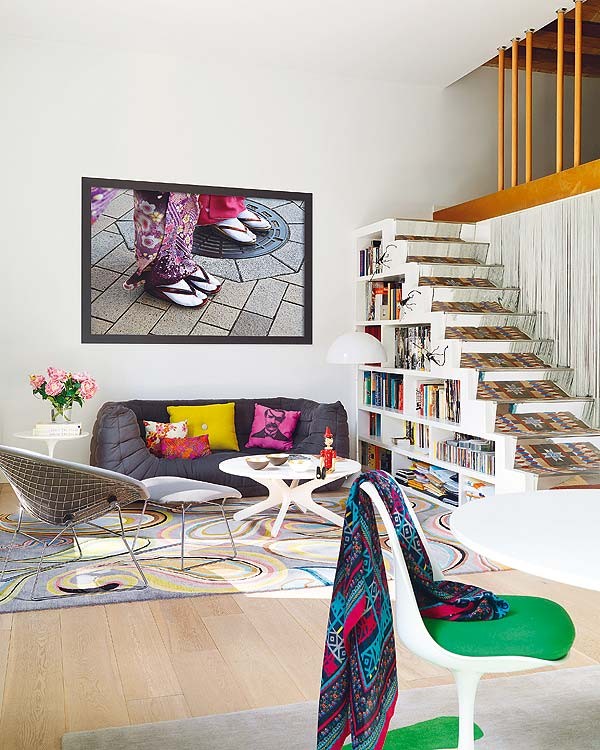
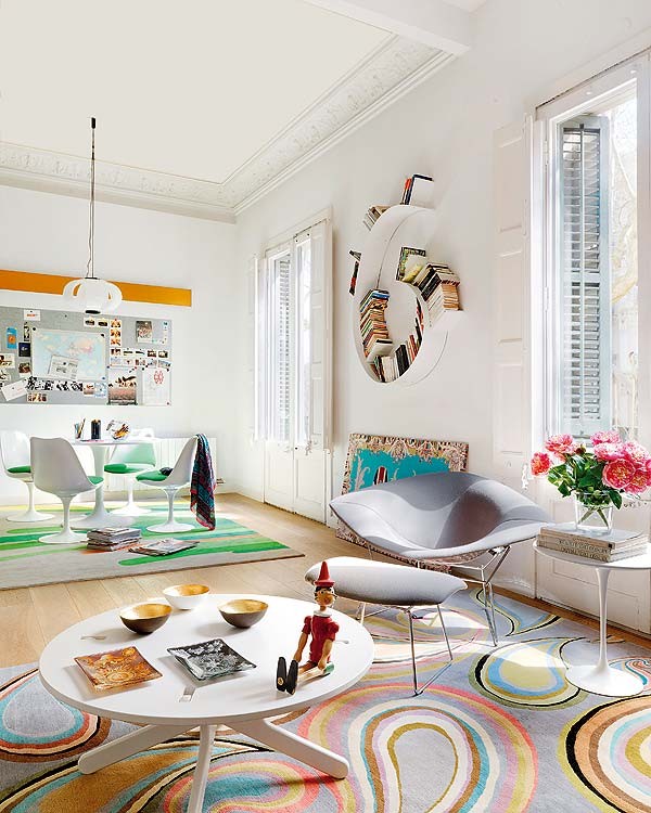
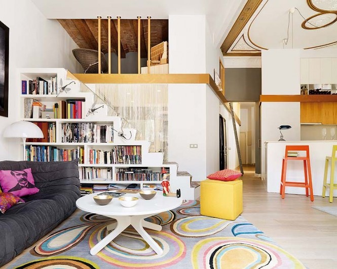
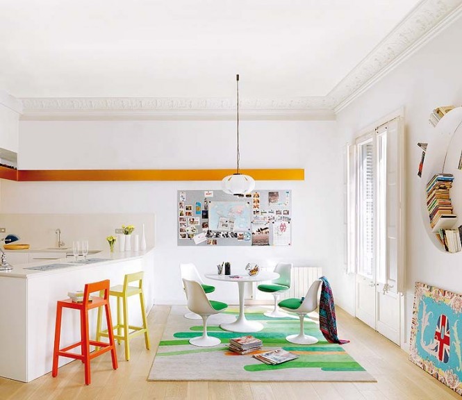
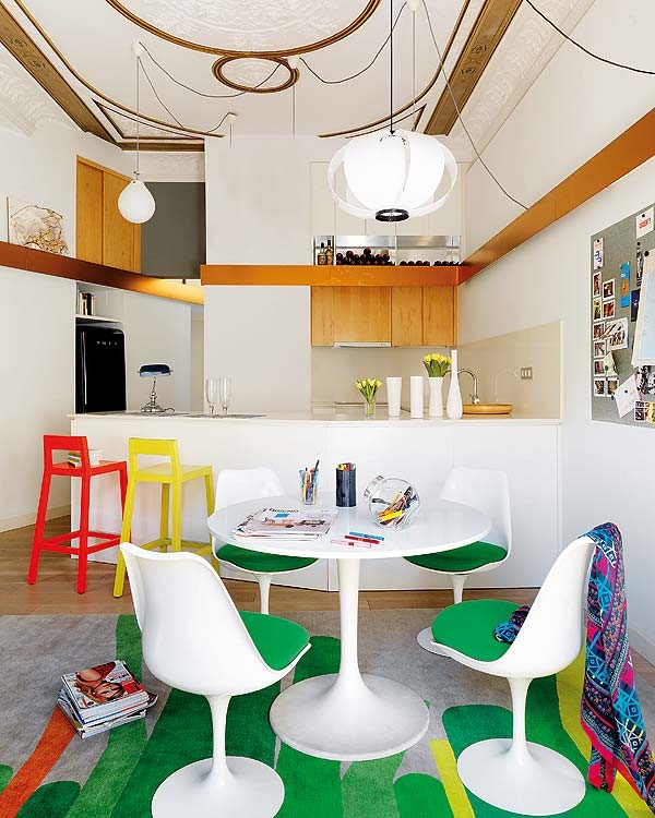
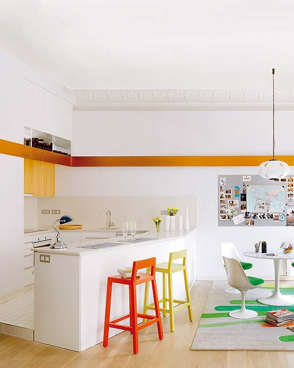
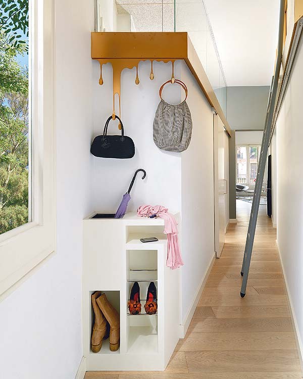
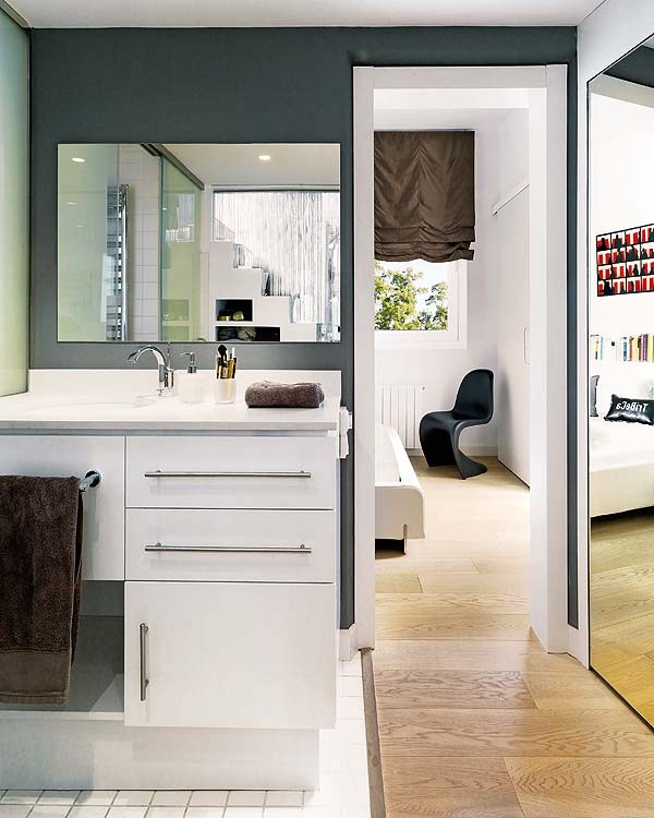
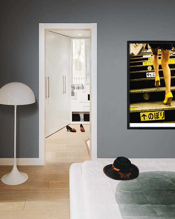
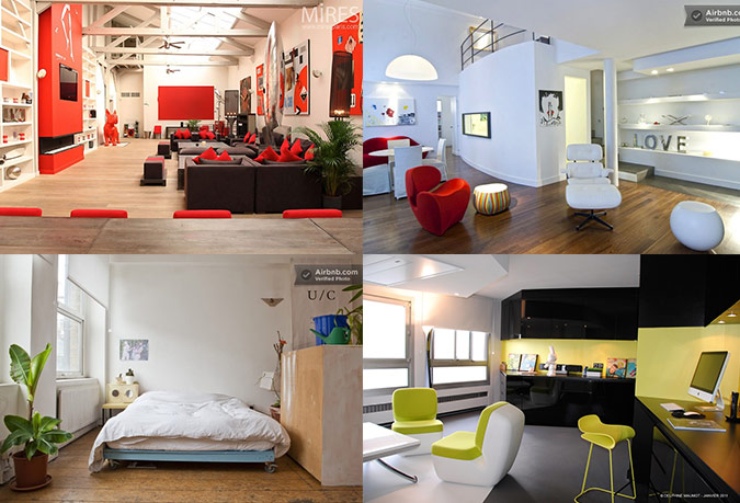
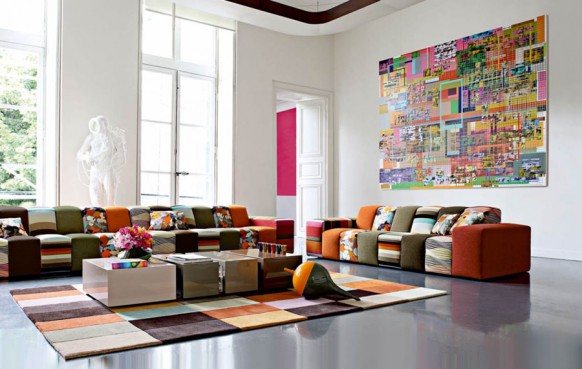
| Posted: 26 Aug 2011 09:08 AM PDT If you’ve been to Barcelona, you’ve definitely experienced the vibrancy, magnitude, and quirkiness of its architecture. After all, Gaudi’s distinctive and beautiful architectural works are hard to miss, and so is this Barcelona home featured on Mi Casa Revista. We see the vibrant colors and the funkiness that define the Catalan region and are enamored with the playful, almost child-like decor. The interiors of this home are simple and wonderfully chaotic all at the same time. For more regular updates from Home Designing, join us on Facebook. If you are reading this through e-mail, please consider forwarding this mail to a few of your friends who are into interior design. Come on, you know who they are! Similar Posts: |
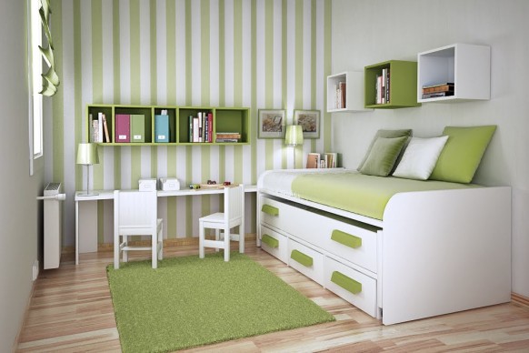
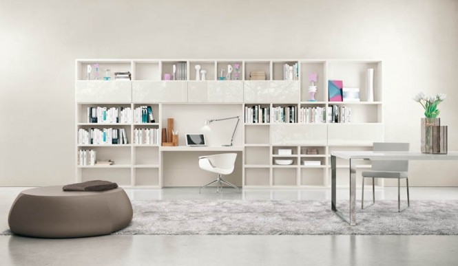
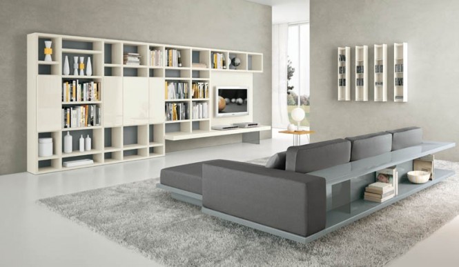
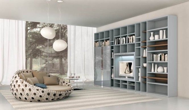
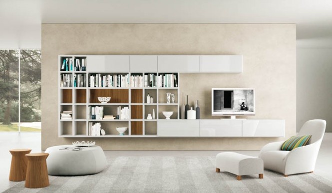
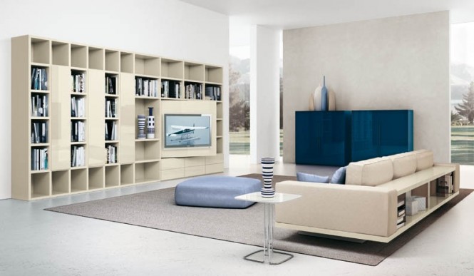
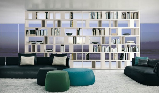
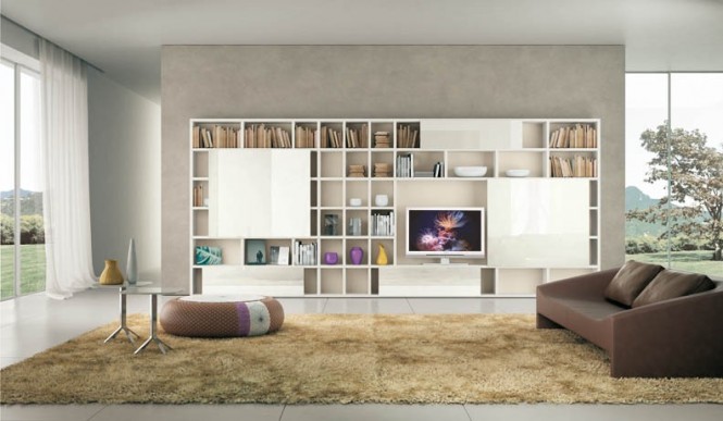
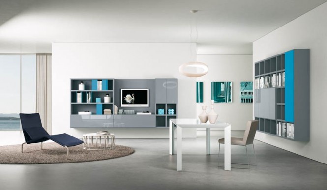
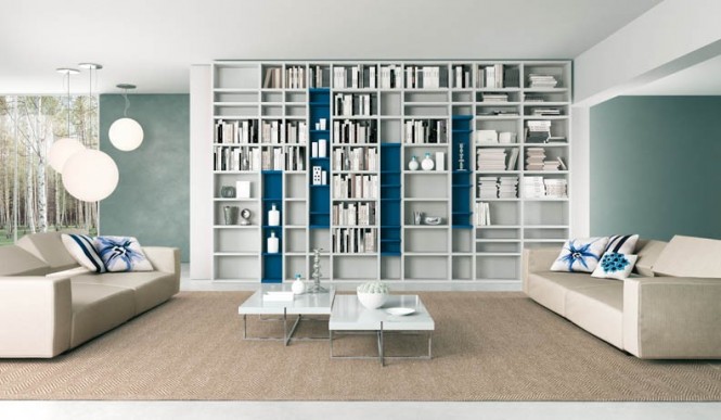
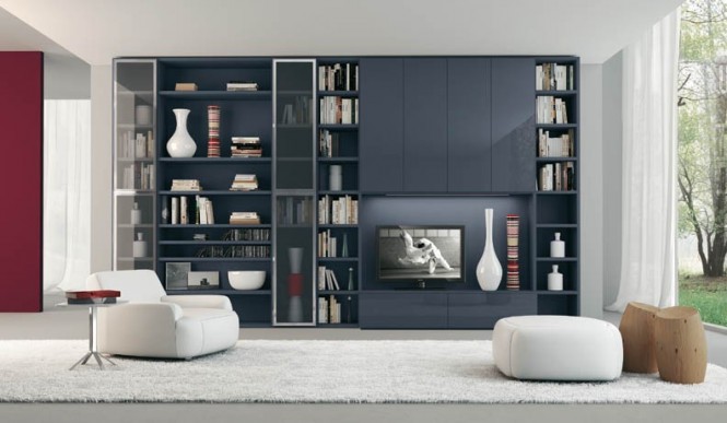
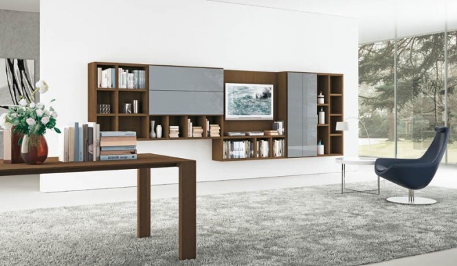
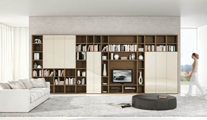
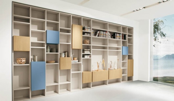
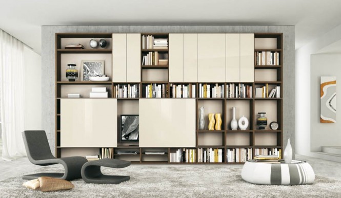
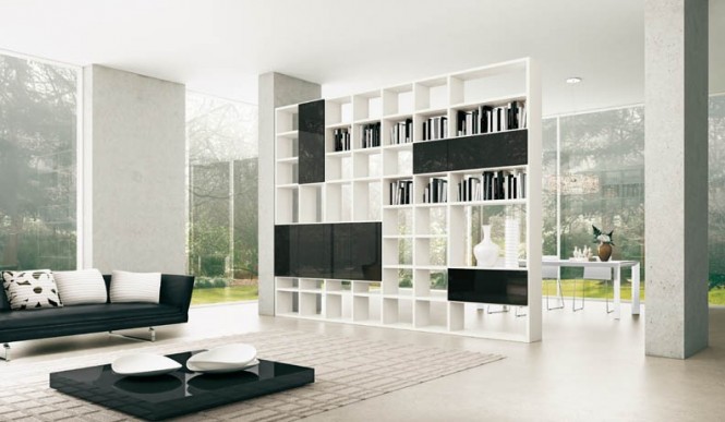
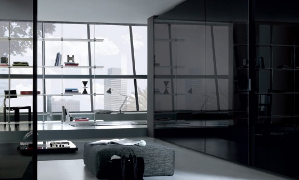
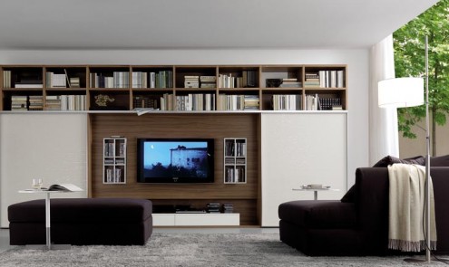
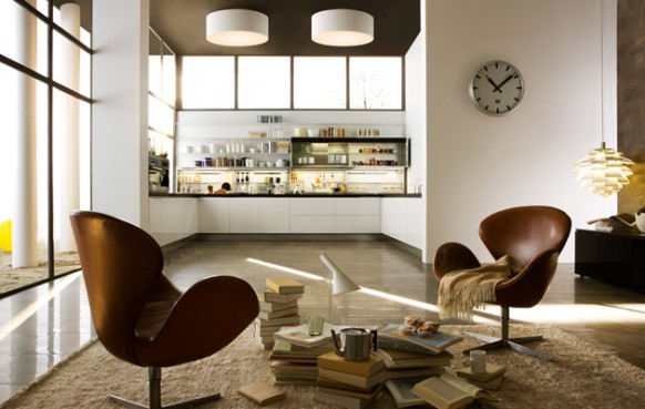
| Posted: 25 Aug 2011 08:03 AM PDT More inspiration from Alf da Fre. Previously, we showcased their solutions for rooms with TV as focus, but this set lays emphasis on shelving. We like how this collection is a mix and match of sort. Some are wall-attached, some have easy access from 2 sides, some are partially concealed by sliding doors and all come in a plethora of shades. Looks like they have done a good job in making a rather dull, furniture unit into an interesting, colorful piece that brings out your living space. The one caveat is that you will need quite a large room to pull this off. For more regular updates from Home Designing, join us on Facebook. If you are reading this through e-mail, please consider forwarding this mail to a few of your friends who are into interior design. Come on, you know who they are! Similar Posts: |
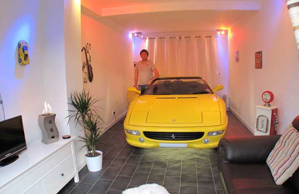
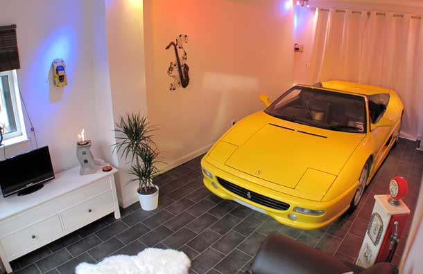
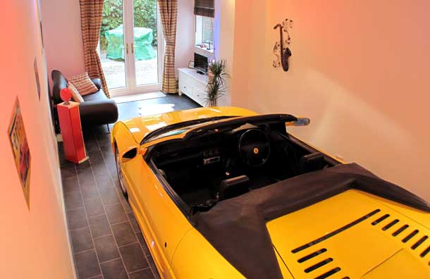
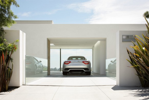
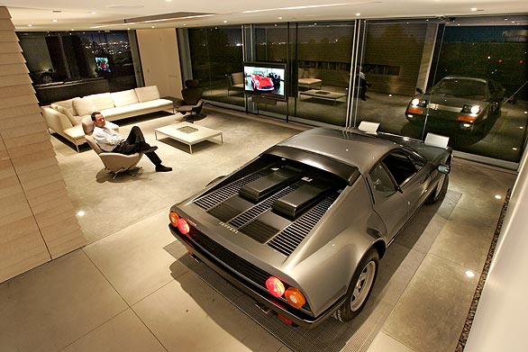
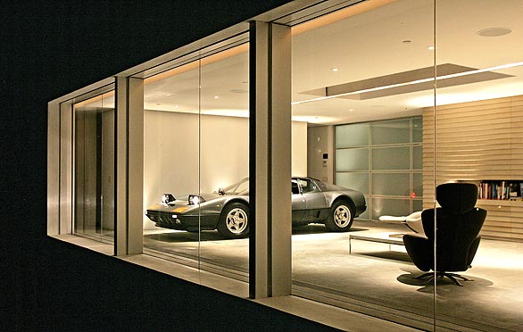
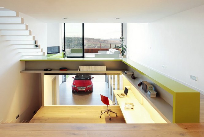
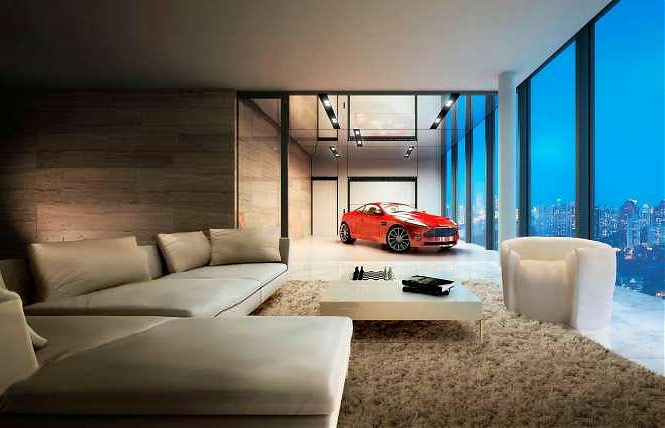
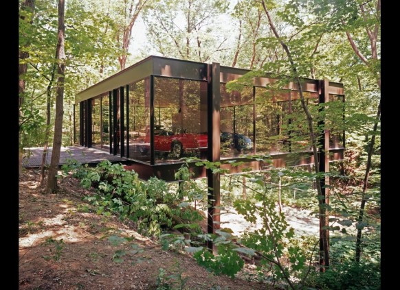
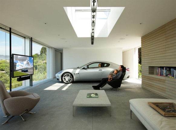
| Cars Parked Inside Homes: Pretty or Pretty Weird? Posted: 24 Aug 2011 09:10 AM PDT Okay, here is something quirky – cars parked inside homes. And no, we don’t mean the garage. To some it may seem ridiculous or even a bit snobbish. To others who cannot bare to have their beautiful ride out of their sight, their cars serve as the best accessory, adding to the decor of the house either by serving up a punch of color, elevating the level of modernity and luxury, or enhancing the specific style of the very surrounding rooms.
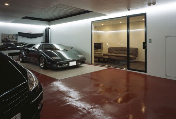
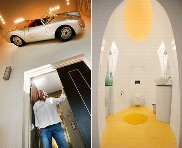
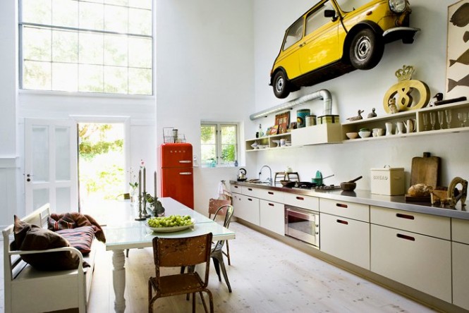
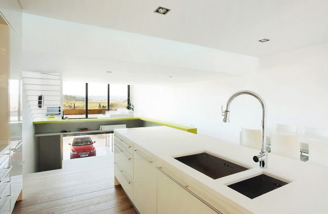
It is not just Ferrari owners. We featured the Takuya Tsuchida modern, Tokyo home on Home-Designing last year, but thought it fit to revisit for this post because of its state of the art garage, complete with an elevator that allows the tenant to showcase his car collection in his own living room… and retract it back into the basement once he gets tired of looking at their glistening bumpers. Who can forget Holger Schubert’s award-winning 1,200 square foot garage? Using polished, concrete, glass, and hologan lighting, Schubert created a minimalistic garage which cast spotlight on what should be the center of the garage — the car, and which also won him Maserati and Architectural Digest’s Design Driven contest for best garage for 2011. Check out the video walkthrough. Schubert’s garage was featured again on LA times later. (You can view the full slideshow here.) This silver BMW is as sleek as the stylish bachelor pad it is parked in. (Design by Addoy) The only features that define the garage space from the mostly open layout, are the wooden bars that serve as a partial “gate” and the long bench separating the car from the living area. The step house we featured yesterday has one inside as well. Same floor car parking is often a feature in luxury apartments. Sometimes people may not just want to ‘park’ cars inside homes. For a more decorous use, they might choose to hang it up as a showpiece. Just like what Mr. Gil Dezer did with his 1950 Porsche Spyder 550. That’s right, Mr. Dezer decided against actually driving his lovely porsche about town, and instead went through the trouble of employing a team of technicians to attach the car on a wall, above one of the doors in his luxury condo. As he has about another 7 Porsches, it seems he doesn’t mind having this one just for show, especially when he can control its headlights and horn from a touchscreen system next to the door. And sometimes just half a car would do fine as well. While not quite as ostentatious as Dezer’s design idea, the quaint and quirky feel of this kitchen is emphasized by the small, bright yellow Mini-coop, spliced in half, and installed above the kitchen counter. So what do you guys think? Pretty or pretty weird? For more regular updates from Home Designing, join us on Facebook. If you are reading this through e-mail, please consider forwarding this mail to a few of your friends who are into interior design. Come on, you know who they are! Similar Posts: |
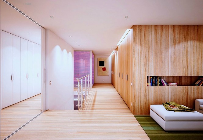
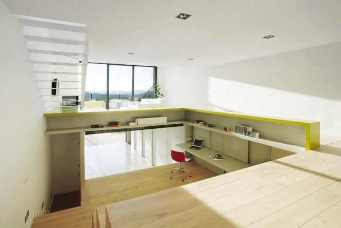
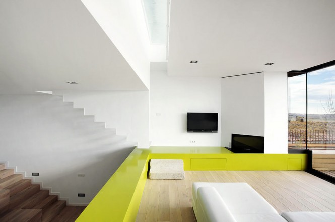
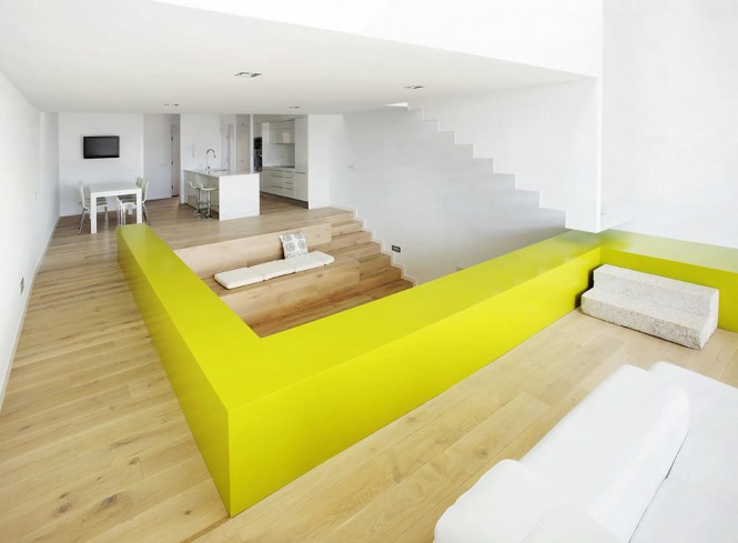
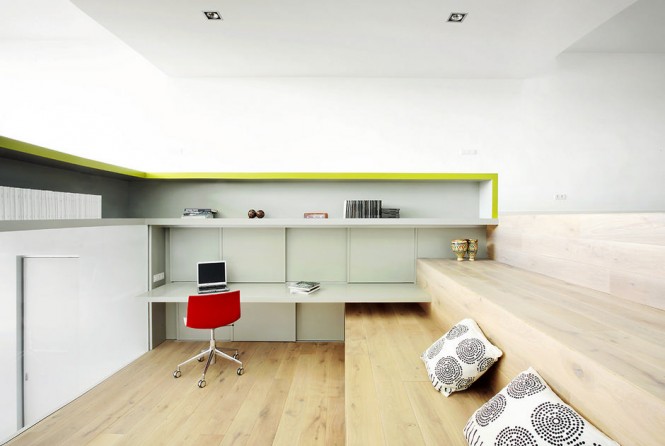
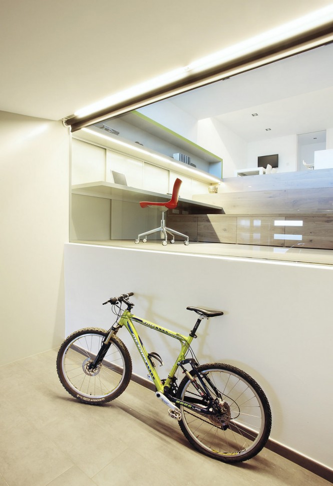
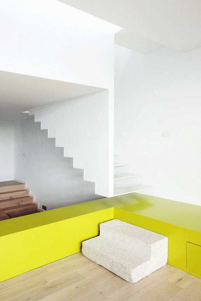
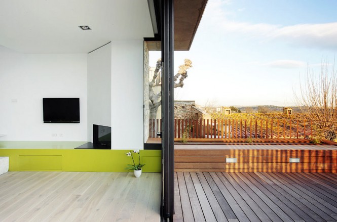
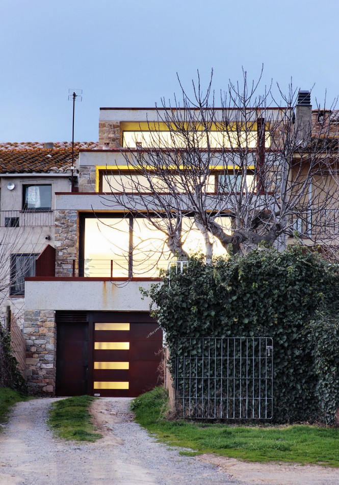
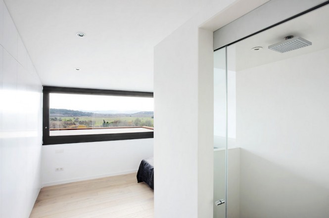
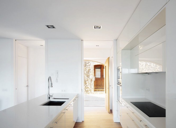
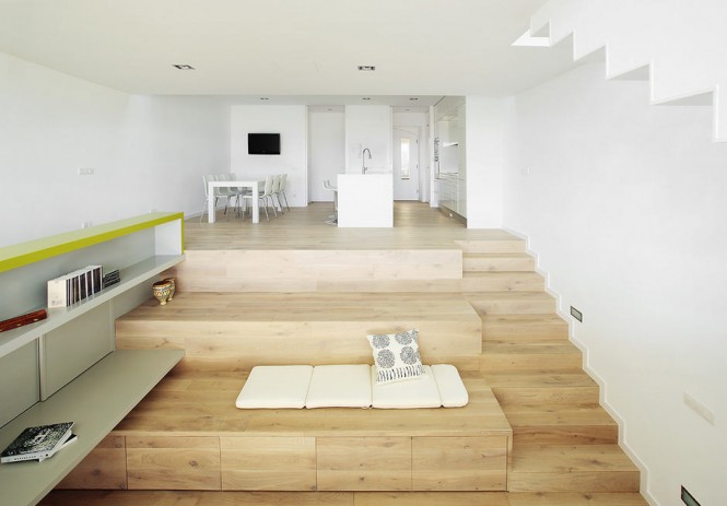
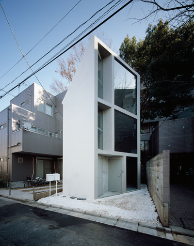
| Step House: Fabulous Minimalism Posted: 23 Aug 2011 08:49 AM PDT How do you design a spacious house on a narrow plot of land? You take a cue from 05 AM Arquitectura and build a step house! The Catalonian architects worked wonders with this split-level, minimalistic home that employs a terraced design in its interiors and exteriors. For more regular updates from Home Designing, join us on Facebook. If you are reading this through e-mail, please consider forwarding this mail to a few of your friends who are into interior design. Come on, you know who they are! Similar Posts: |
| You are subscribed to email updates from Interior Design Ideas To stop receiving these emails, you may unsubscribe now. | Email delivery powered by Google |
| Google Inc., 20 West Kinzie, Chicago IL USA 60610 | |











0 Response to "“Barcelona House Oozes Color” plus 3 more"
Post a Comment
Note: Only a member of this blog may post a comment.